[E]very year around this time, I eagerly await word from our accountant as to whether we will owe the Federal government money, or whether we will be owed a refund. I don’t know, maybe it’s just me, but I feel completely disconnected from what the money that we pay the Federal government is used for. When I get a credit card statement, I can scan the items to see what makes up the total. What we need is a clear invoice of our Federal income tax.
What I’d like to see is an itemized list of expenditures for which I am being charged, much like a credit card statement. Each major section of the Federal budget for that tax year would be itemized, and displayed as a proportion of my total tax bill.
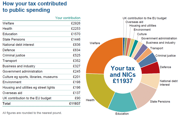
Here is an example. In 2015, the average U.S. taxpayer paid $12,978 in income tax. Let’s round that to $13,000 to make it nice and even. The Federal government had a $3.7 trillion budget in 2015. I looked up the Federal budget for 2015, and created the following invoice for the average U.S. taxpayer:

An invoice like this provides useful context. It tells me, as a taxpayer, where it is my money is going. An average taxpayer in 2015 was billed about $2,000 for National Defense. The top five categories in the Federal budget—Social Security, National Defense, Medicare, Income Security, and Health—cost the average tax payer $10,600. That’s 82% of the entire tax bill.
The Federal budget is public, of course, but the numbers are so big as to be meaningless to the average taxpayer. Providing an invoice that shows the breakdown of your tax bill against the budgeting categories removes some of the abstraction. After all, when you get a credit card statement, you usually look at it to see how you spent your money—or to see if mistakes have been made.
An invoice like this also provides more context come election season and politicians begin talking about raising taxes and cutting spending—or vice versa. For example, suppose a proposal is made to add $50 billion to National Defense. Well, it makes it easy to see that it would alter the average taxpayer’s bill from $13,000 to $13,176 a year. Of course, when a big expenditure is added, a cut is usually made elsewhere. Maybe we’d need a chart on the invoice showing how much we spent in the same category in the previous year so we can see the change. The bills I get from the water company do this.
Each invoice would be tailored to the individual taxpayer. If you pay $25,000 in taxes, you’ll see a proportional increase in what you’ve been invoiced for. If you pay $7,900, you’ll see a proportional decrease.
I’d like to see the IRS begin producing an invoice like this so that I have a better sense of how my tax bill related to the Federal budget. In other words where the government is spending my money.
If I offered this idea free to the IRS, does that count as a charitable donation?
Comments